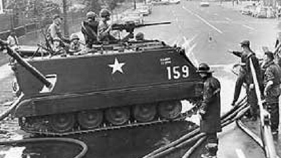
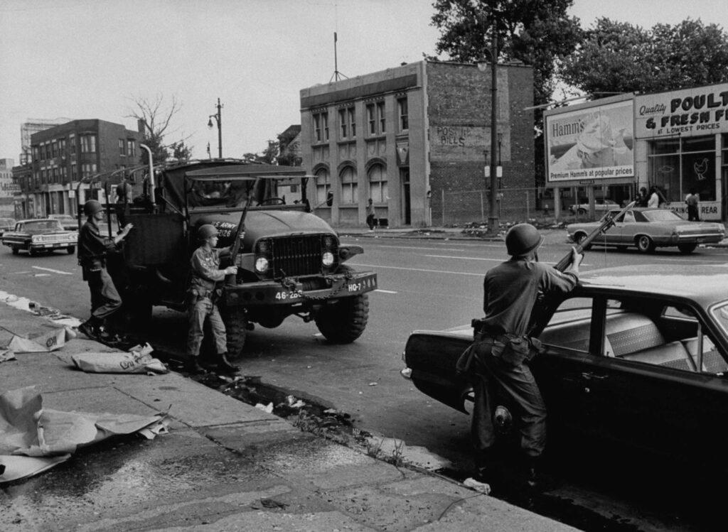
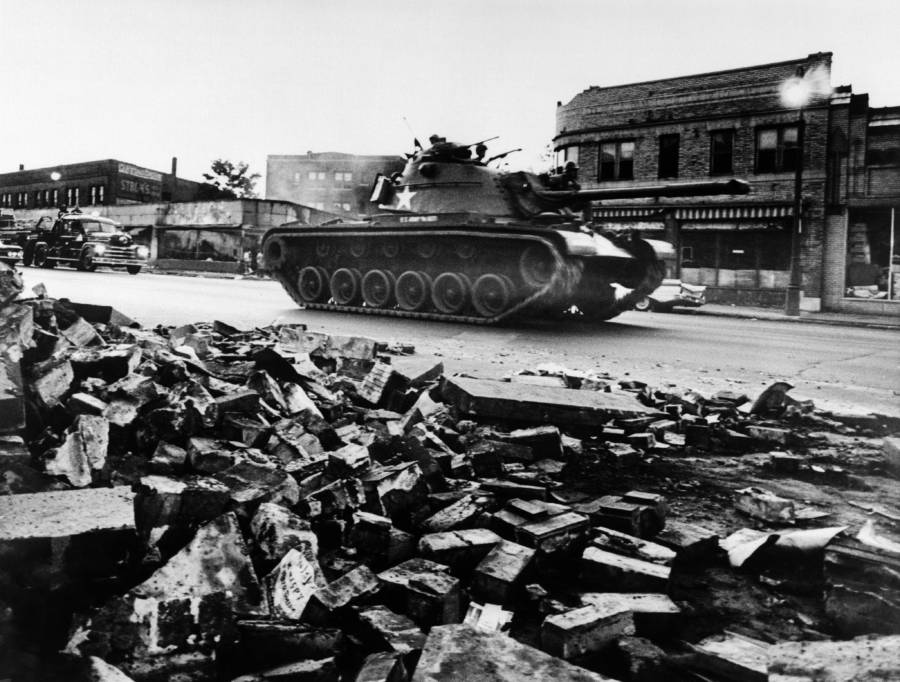
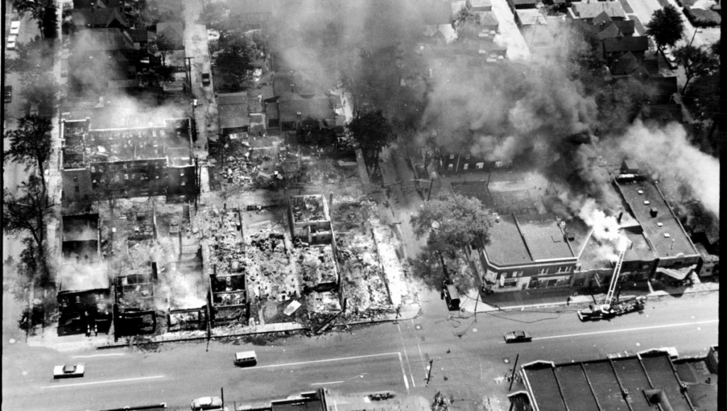
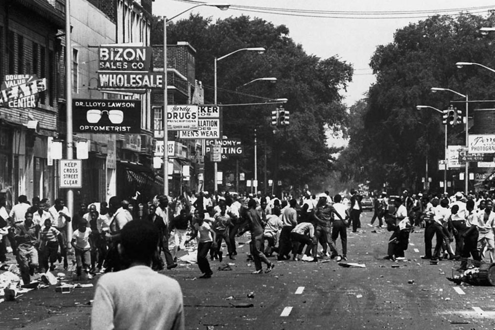
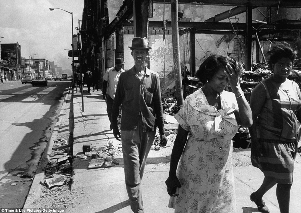
"The 1967 Detroit Riots were among the most violent and destructive riots in U.S. history. By the time the bloodshed, burning and looting ended after five days, 43 people were dead, 342 injured, nearly 1,400 buildings had been burned and some 7,000 National Guard and U.S. Army troops had been called into service."
Musical interpretations
Gordon Lightfoot - Black Day In JulyJohn Lee Hooker - The Motor City's Burning (blues)MC5 - The Motor City's Burning (John Lee Hooker cover) (angry rock)
I was but a mere sprout; too old to be a child, way too young to be a man. It was a Sunday morning on the family farm in Ontario. The family was heading back to Detroit that day and I was listening to CKLW while breakfast was being prepared ... when I heard the border had been closed.
Say what???
We didn't have TV on the farm - this was in the days of only 3 networks (Detroit had 4: ABC, CBS, CBC (Windsor), NBC) and we were out of range of all. Hey, we had just stopped using the old style wooden crank phones on a party line this year. (It now hangs on my wall)
A hot, muggy, stagnant July night in the city. Police decide to raid an after-hours speak-easy. A crowd of bored hot willing to check out any unusual goings-on gathered as the police were loading up near-on 100 saloon customers for an all-expenses paid night courtesy of the city. After discussing the situation among themselves and the police along with a combination of alcohol, weed, and boredom in the middle of the night, things quickly got out of hand by early Sunday morning. Ontario was worried about spill-over into Windsor and closed the crossings between Windsor and Sarnia: both bridges, the tunnel, and the ferry.
Better to be stuck on the Canadian side of the border - at least in my eyes.
Detroit was the 5th largest city in the US at the time. The entire city, including the giant auto industry, was shut down for two days. The riots continued for almost a week. What puzzled most was that Detroit was considered "negro-friendly": plentiful jobs, good pay, well-kept neighborhoods; "a city with a reputation for being almost a model in race relations."
"an all-white police force raided a blind pig that was frequented by Blacks on Clairmount Street. Eighty-two people were on their way to jail when a crowd gathered and the riot broke out. After six days of fire and rage, 43 people had died. Arson and looting took their toll on the city."
"When the border was restricted, Canadians lined the waterfront on the Canadian side. With the safety of the river between them, they sat in lawn chairs or on the hoods of their cars in a silent vigil. They listened to the sound of gunfire and sirens, and watched the fires and tracer bullets streak across the night sky. They pointed to each new outbreak, as if they were watching a sporting event, or as if they had front-row seats at the theatre."
"In the rioting that broke out shortly before dawn on Sunday, 2,000 Detroit police were overwhelmed quickly. So were 350 State police. The Michigan National Guard, moving in with 7,100 men on Sunday afternoon, also proved unable to control the violence. Finally, in the early hours of Tuesday, came the U.S. Army, with 4,700 paratroopers skilled in guerrilla warfare. Even after the Army moved in it took two more days to bring the situation under control."
"In one respect, what happened here was not a "race riot." There was almost no conflict between whites and Negroes.The violence was directed mainly against property—except for the sniping, which was aimed at police, troops and firemen. The main interest: looting. It appeared to be a revolt against law and order. Rioters seemed to have more interest in looting than in killing. As one news reporter wrote: "Violence was aimed not so much at skin color as at color-television sets."
"It was as though the Viet Cong had infiltrated the riot-blackened streets." About 140 square blocks of this West Side area was a battlefield. In all, some 200 or more blocks of the city were riot areas. Entire blocks of buildings were gutted or damaged by fires that often were set with home-made fire bombs.
The peak of the rioting occurred on Monday; the entire city was shut down, most businesses and all government offices were closed. Liquor sales were suspended and a curfew was enforced with live fire. The rioting began to subside by Wednesday but continued for a few more days,
"These mobsters, arsonists and looters were not fighting a civil-rights battle. The neighborhoods torn apart do not teem with unemployment, Times are not desperate in Detroit for people who want and can work, and the rioters . . . were not confined to the unemployed. "Detroit's police . . . have for some time functioned as a disciplined professional police force should conduct itself; they continued to so function . . . even in the face of grave disorder and assault upon themselves. There was no 'police brutality.' No one has confronted the city with any set of demands for remedy of specific conditions. . ."
Some of those blocks are still empty almost 60 years later. The population of Detroit proper now is just over 600,000 where in 1967 it was about 1.6 million - from 5th largest city to 26th.
The border soon re-opened and we made it back to home ... and TV. With scenes of "Rat Patrol" jeeps and tanks on Woodward Ave; black bus drivers from Pontiac driving white National Guardsmen to the black riots in the city, the scenes were as searing as those of JFK's funeral not all that many years before - especially when view live in living colour.
Politicians were being politicians.
John Conyers was already in politics (another good reason for term limits) but got his leg-up during the riots ... and found success in promoting racism.
Mittney's father was governor of Michigan at that time; he called upon LBJ for Federal help in quelling the "whats-going-on?" situation.
The riots cost the Detroit baseball team the pennant in 1967 - placed 2nd - but baseball held the city together in 1968 when they won the World Series and the rest of the country was trying out their own style of riots. The year of Denny McLain but it was the Mickey Lolich Series that beat Bob Gibson. The whole city came together in 1968 - perhaps because of the hindsight realization of what happened in 1967.
I guess you can tell the riots made an impression on me ...
When did the guys in all the bands I liked get so old?
Update: Lyrics added by ghostsniper via Comments
We sail through endless skies Stars shine like eyes The black night sighs The moon in silver trees Falls down in tears Light of the night The Earth, a purple blaze Of sapphire haze In orbit always
While down below the trees Bathed in cool breeze Silver starlight breaks Down from night And so, we pass on by The crimson eye Of great god Mars As we travel the universe
A sample of some obscure – and some maybe not obscure – tunes from my strange and off-the-wall collection.
Today’s selection: Hawkwind - Orgone Accumulator
Seems last week's selection was substandard so I'll try something a bit different this week.
Orgone: "a pseudoscientific concept variously described as an esoteric energy or hypothetical universal life force" Orgone Accumulator: a device invented by Wilhelm Reich in the 1930s to collect and concentrate life energy.
Off Hawkwind's 1973 live album "Space Ritual"
Called "cosmic rock"; a bit harder in nature than psychedelia. Well - maybe a lot harder. Crank it up and dance like nobody's sober ...
Some comments: - They're not THAT bad, but definitely an acquired taste kind of band. - Weird and not on my playlist, but if you're driving down the road and it comes on, you can change the station. - It's not exactly "Set the Controls for the Heart of the Sun" - They were an acid biker thing back in the day, and you can see why. I like a blast of it now and again. - OK - it's just me, but both "Set the Controls for the Heart of the Sun" and "Orgone Accumulater" are among my favorites.
And I have to agree with the last comment ... and I have more Hawkwind selections for the future playlist :)
In about 1862, gold was discovered in Grimes Creek in what was then Washington Territory; later to become the 300 square mile Boise Basin mining district. It is claimed that more gold was eventually pulled out of the Boise Basin mines than from either the California or Klondike mines. Almost 3 million ounces of gold were produced in the district.
As it happened, the main route to the diggings was from the west. Miners from California, Oregon, and California, seeking the next promise of riches, would travel from Portland to Umatilla on the Columbia River, then overland (roughly along today's US30/I-84) by stage or wagon - crossing into what is now Idaho near Weiser on the Snake River upriver from the treacherous Hells Canyon.
A mail route was soon established along the Idaho road with two stations along the 100 mile stretch between the Snake River and Placerville, the primary town at the time in the gold district.
The major mines played out long ago, mail routes have shifted, Placerville is a near ghost-town, and the stage and mail stations no longer exist - even the ruins have melted back into the land.
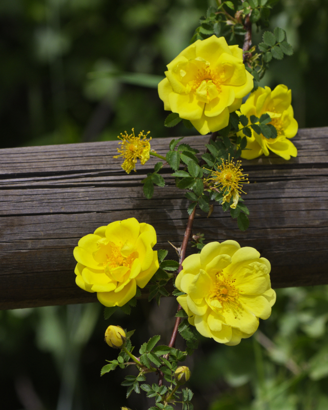
Except at this one location, these roses remain - leaving with them thoughts of those who once lived here and planted them.
"18 states continue to defy executive order banning biological boys in girl's sports"
Why is this even an issue? Why should it need an executive order in the first place? ... and what do states gain by insisting boys play on girls teams? There must be money involved ...
Having been one, I understand what teenage boys get out of it ... having matured (maybe), I understand what girls lose from it.
This crap started with LBJ's Civil Rights Act and went crazy with Title IX in 1972. Then lawsuit upon lawsuit.
Now here we are.
Time to bring back a bit of discrimination and segregation back to our world.