Something Different
There’s something about this photo I’ve always liked. It was taken in 2013 and something inside back then inspired me to play with color settings on one of my image processors. I liked what I had come up then with so I re-did the processing here some 12 years later.
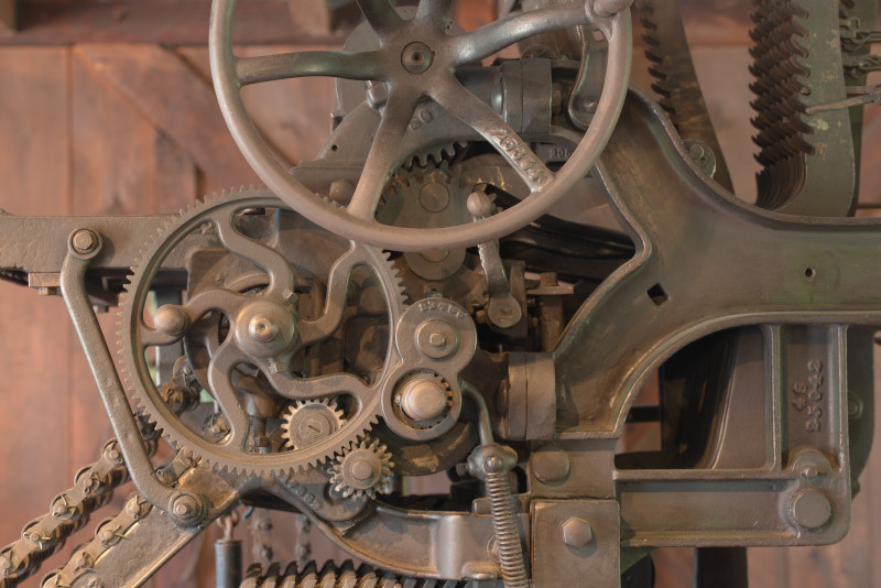
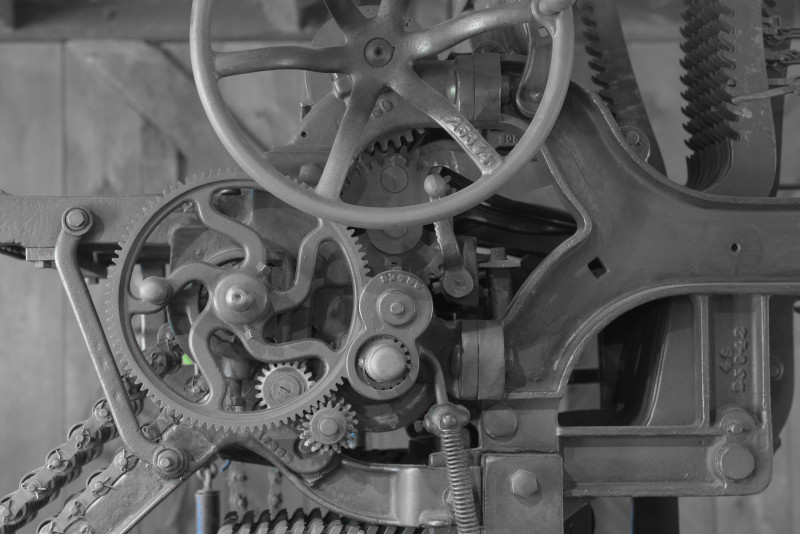
The original NEF image was taken under natural daylight, has pixel size of 7370/4916, was translated to TIF with ProPhoto color, then scaled with no further processing to 800/534 JPG with zero-compression and print resolution of 300px/in.
But I go further … and y’all get to experience the joy of pretending you’re in an art gallery, examining works of “fine art” exploring variations in hue, saturation, and a bonus example image of edge detection.
Or not …
The same conversions and scaling were used as in the original print with the addition of adjusting hue and saturation. No mixture of hues was utilized; color filters were RED, YEL, GRN, CYN, BLU, and MAG. Saturation levels for each color were 0% or 100%.
Only RED:
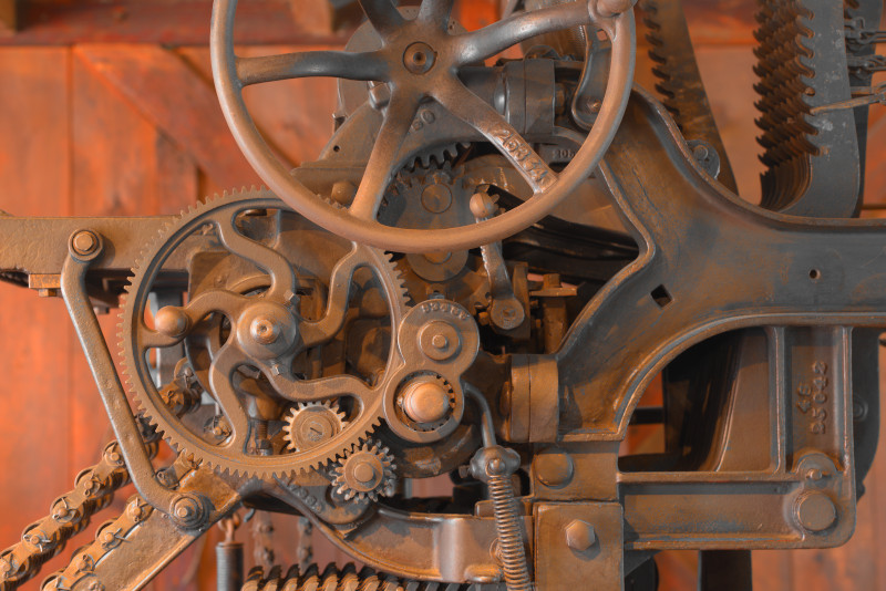
The RED only appears more orange than red and appears over-emphasized when other colors are removed.
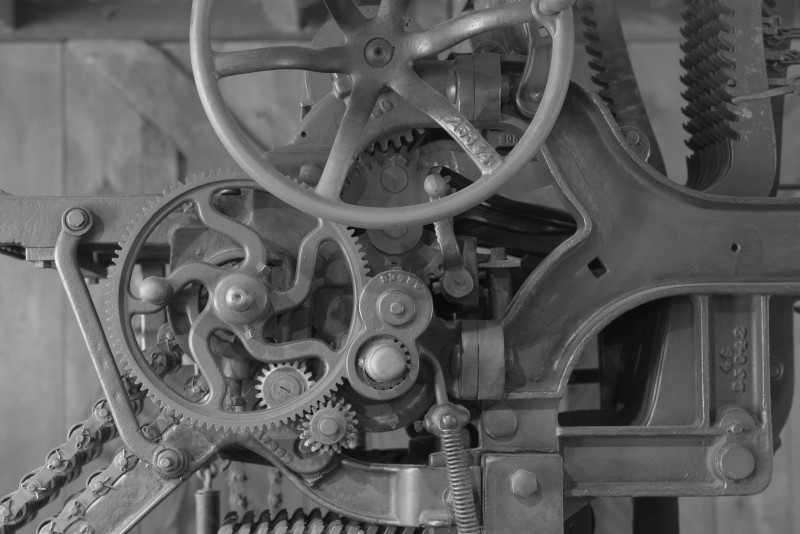
Only YEL:
On the other hand, while YEL-only is mostly emphasized on the edges, the color is not as over-whelming as RED-only.
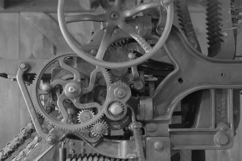
All colors except RED and YEL:
Other than a small hint of green grass through a gap in the machinery, it appears to be a black&white image.
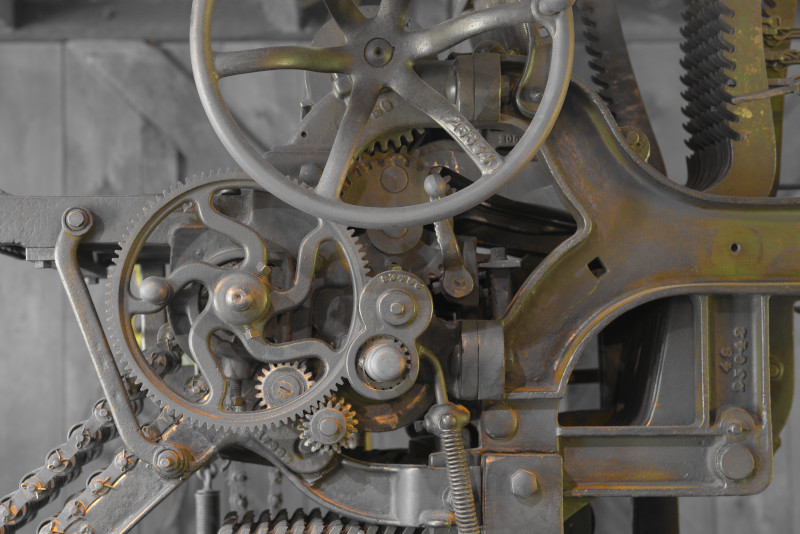
All set to 0% saturation:
With all colors set to 0% saturation, the image appears fully B&W
No adjustments to saturation or hue; conversion of ORIG to Gray-scale (B&W)
At this scale, it’s hard to differentiate between the last three, but there are subtle differences between the 0-saturation image and the gray-scale image. Differences in the conversion algorithms but subtle enough to not be noticeable at first glance of a scaled image.
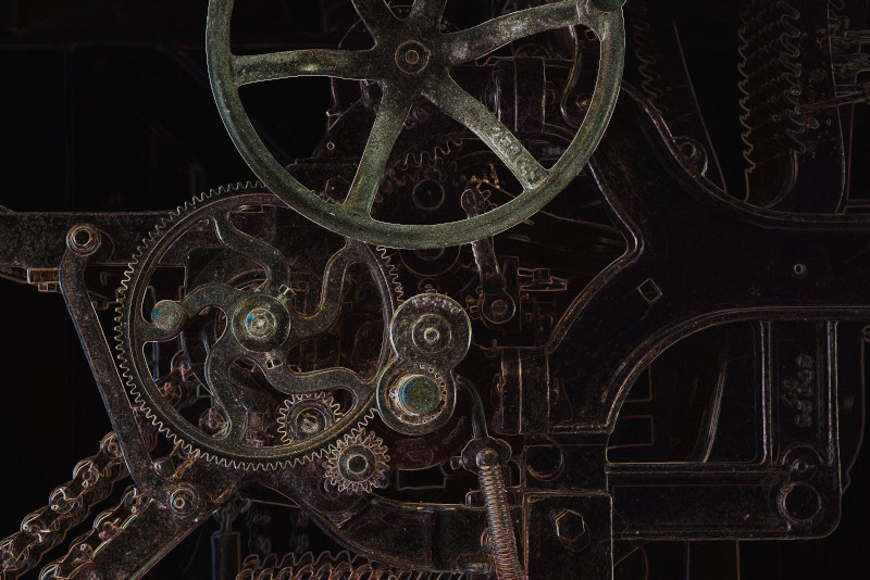
Just for grins, I applied a basic EdgeDetect filter:
There you have it.
The original is OK as is, but I believe my preference is B&W.
B&W always seems to have a sense of blunt honesty to it no matter what format.
The photos themselves are artistic, but the mechanical engineering of whatever that object is displays its own artistic beauty.
Amazing. The first one, especially, looks 3D.
This is the color paradigm I spend my whole teaching career trying to get my pastellists away from. But, that’s understood since they are a pole apart as far as how color works.
It is a cool photo, and I do like your take-down of the color process. I am forced to exist in that space when I use Photoshop.
If I were to guess, I’d say that device is some sort of vintage printing machine.
It’s in very clean, perhaps restored, shape.
Yet it seems to be in an old building, or, old building back drop, like in say, a museum.
AI overview:
The image depicts the intricate gear mechanism of what appears to be an early 20th-century movie projector. These machines, which were crucial for bringing moving images to the public, worked by using a series of gears, sprockets, and a hand crank to advance film past a light source and project the images onto a screen.
I forget exactly but it’s a piece of 1895-ish machining or farming equipment (thresher comes to mind). Picture taken in 2013 probably in the midwest. Definitely not a projector, I seriously doubt it was a printing press (stored outside in a shed). Not sure I can backtrack its location anymore.
Notes – things I wish now I had done then.
Thresher – pulled behind a tractor?
The mechanism seems kind of “delicate” and not meant for extreme field endurance. But what do I know?