I should be ashamed having read so little of so few poets and nothing at all of so many more. they've spent their lives writing words just for the likes of me and I barely know but a few. I should be ashamed to do what I do like I'm the only one who has ever done it when it's mostly been done already and better and oftener before. I should be ashamed and burn my notebooks and break my pencils and read what's already been written and what's being written now. But I am reading what's being written now this minute by me and some others here and there when I can and when I want. I should be ashamed of thinking about quitting. someone somewhere might someday read what I wrote yesterday or today and think about writing what they have to say in their own way and another link gets added to the chain and another chapter is added to the story. I should be ashamed for doing so little. But I'm not.
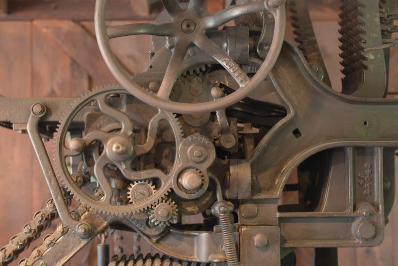
There's something about this photo I've always liked. It was taken in 2013 and something inside back then inspired me to play with color settings on one of my image processors. I liked what I had come up then with so I re-did the processing here some 12 years later.
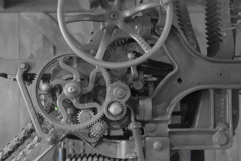
Original image: NEF to TIF to zero-compression JPG, no further processing other than scaling.
The original NEF image was taken under natural daylight, has pixel size of 7370/4916, was translated to TIF with ProPhoto color, then scaled with no further processing to 800/534 JPG with zero-compression and print resolution of 300px/in.
But I go further ... and y'all get to experience the joy of pretending you're in an art gallery, examining works of "fine art" exploring variations in hue, saturation, and a bonus example image of edge detection.
Or not ...
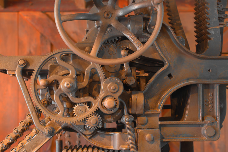
The same conversions and scaling were used as in the original print with the addition of adjusting hue and saturation. No mixture of hues was utilized; color filters were RED, YEL, GRN, CYN, BLU, and MAG. Saturation levels for each color were 0% or 100%.
Only RED:
Only RED
The RED only appears more orange than red and appears over-emphasized when other colors are removed.
Only YEL:
Only YEL
On the other hand, while YEL-only is mostly emphasized on the edges, the color is not as over-whelming as RED-only.
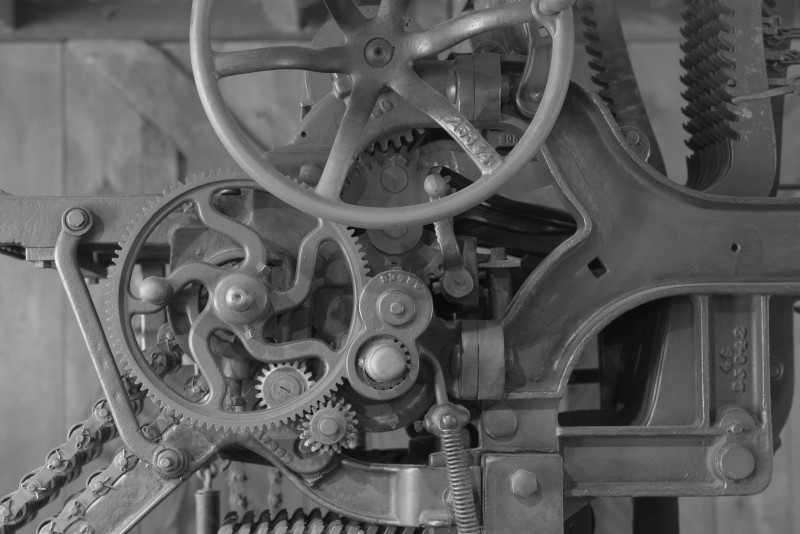
All colors except RED and YEL:
RED, YEL both at 0%
Other than a small hint of green grass through a gap in the machinery, it appears to be a black&white image.
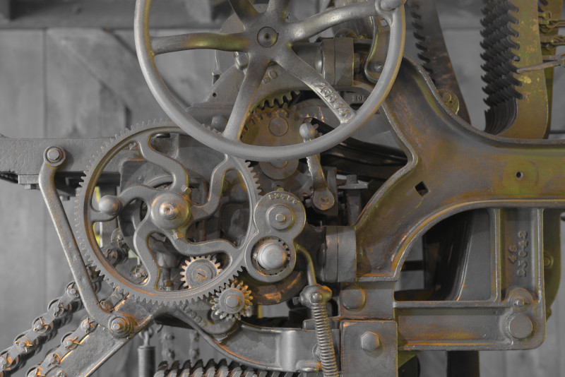
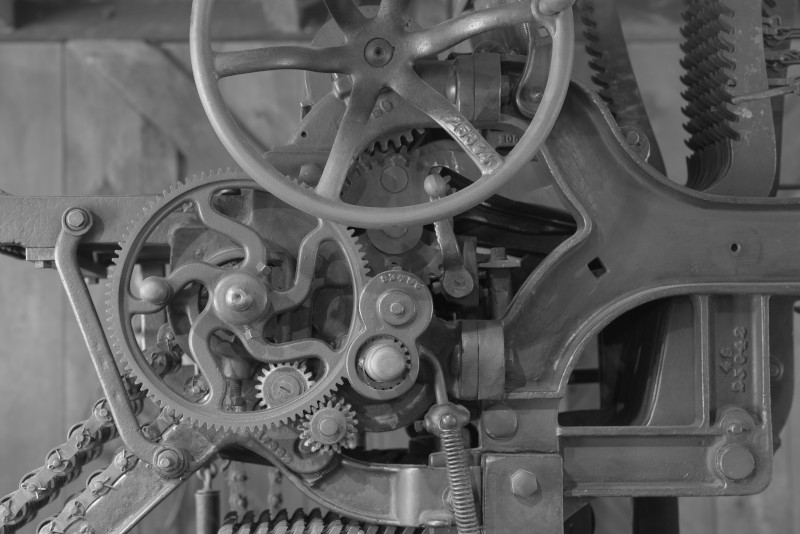
All set to 0% saturation:
All saturation levels at 0%
With all colors set to 0% saturation, the image appears fully B&W
No adjustments to saturation or hue; conversion of ORIG to Gray-scale (B&W)
Color Conversion to Gray-Scale (B&W)
At this scale, it's hard to differentiate between the last three, but there are subtle differences between the 0-saturation image and the gray-scale image. Differences in the conversion algorithms but subtle enough to not be noticeable at first glance of a scaled image.
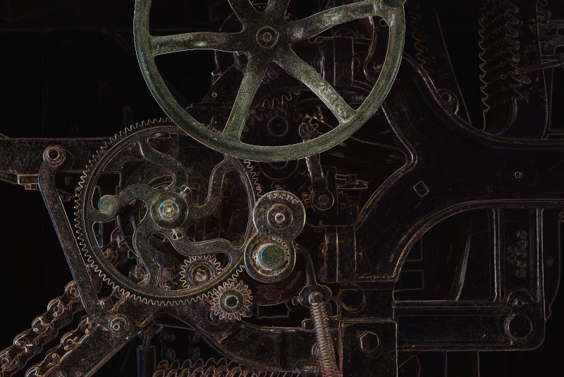
Just for grins, I applied a basic EdgeDetect filter:
Shall we say "avant garde"?
There you have it. The original is OK as is, but I believe my preference is B&W.